
Strings attached
Client | Dipnot

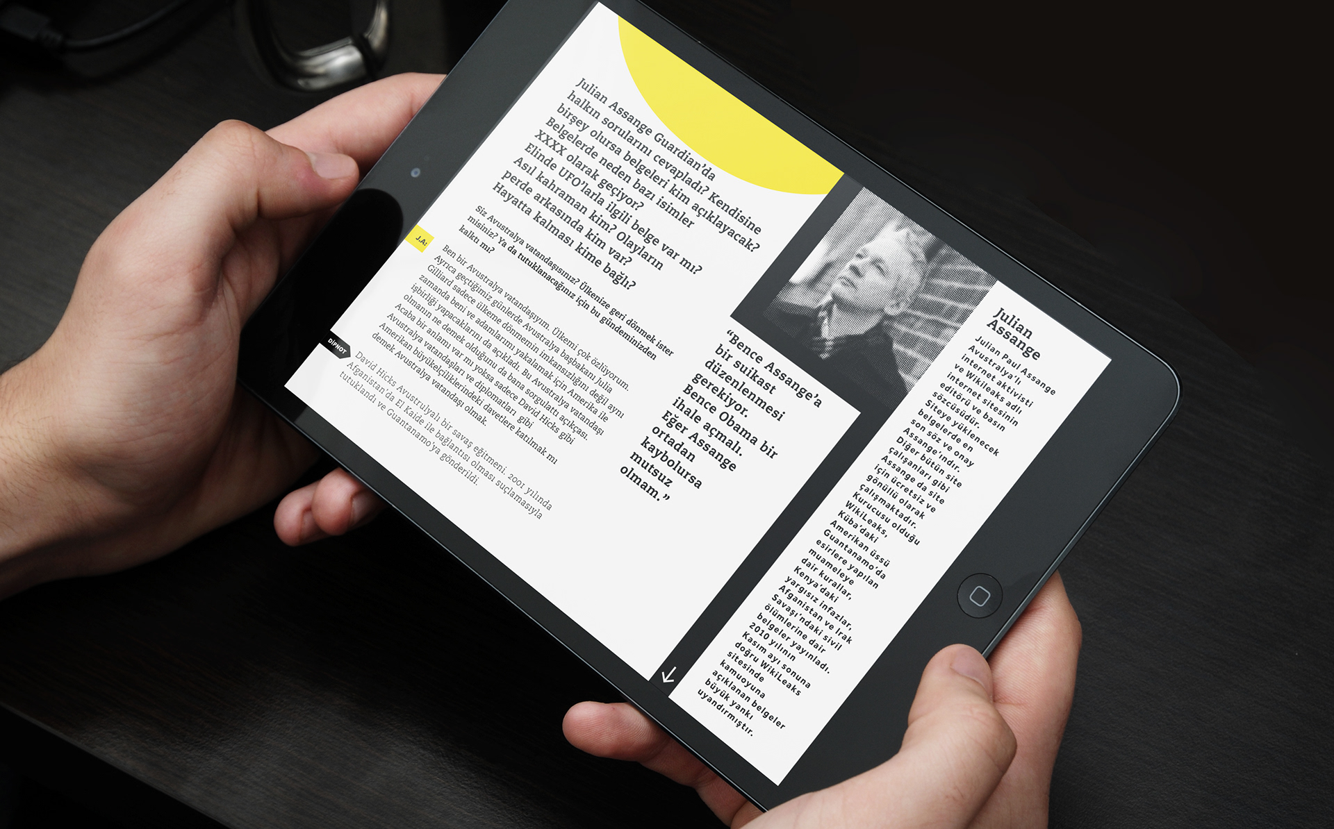
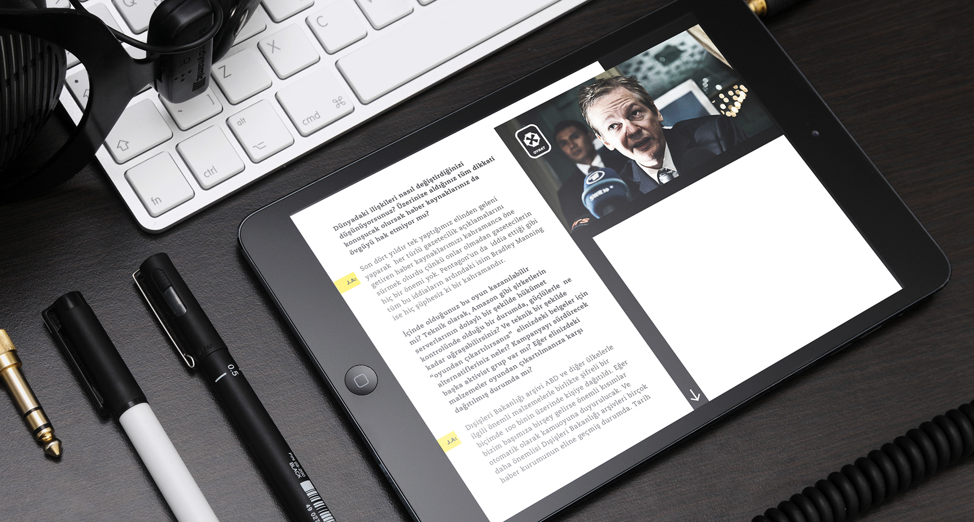
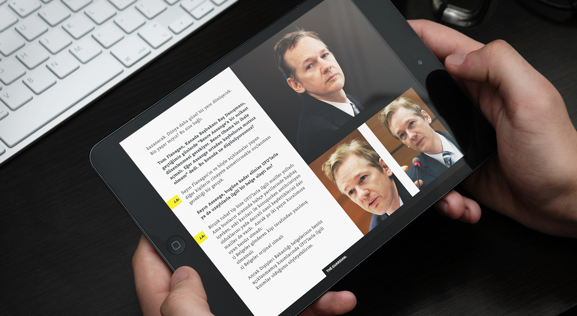
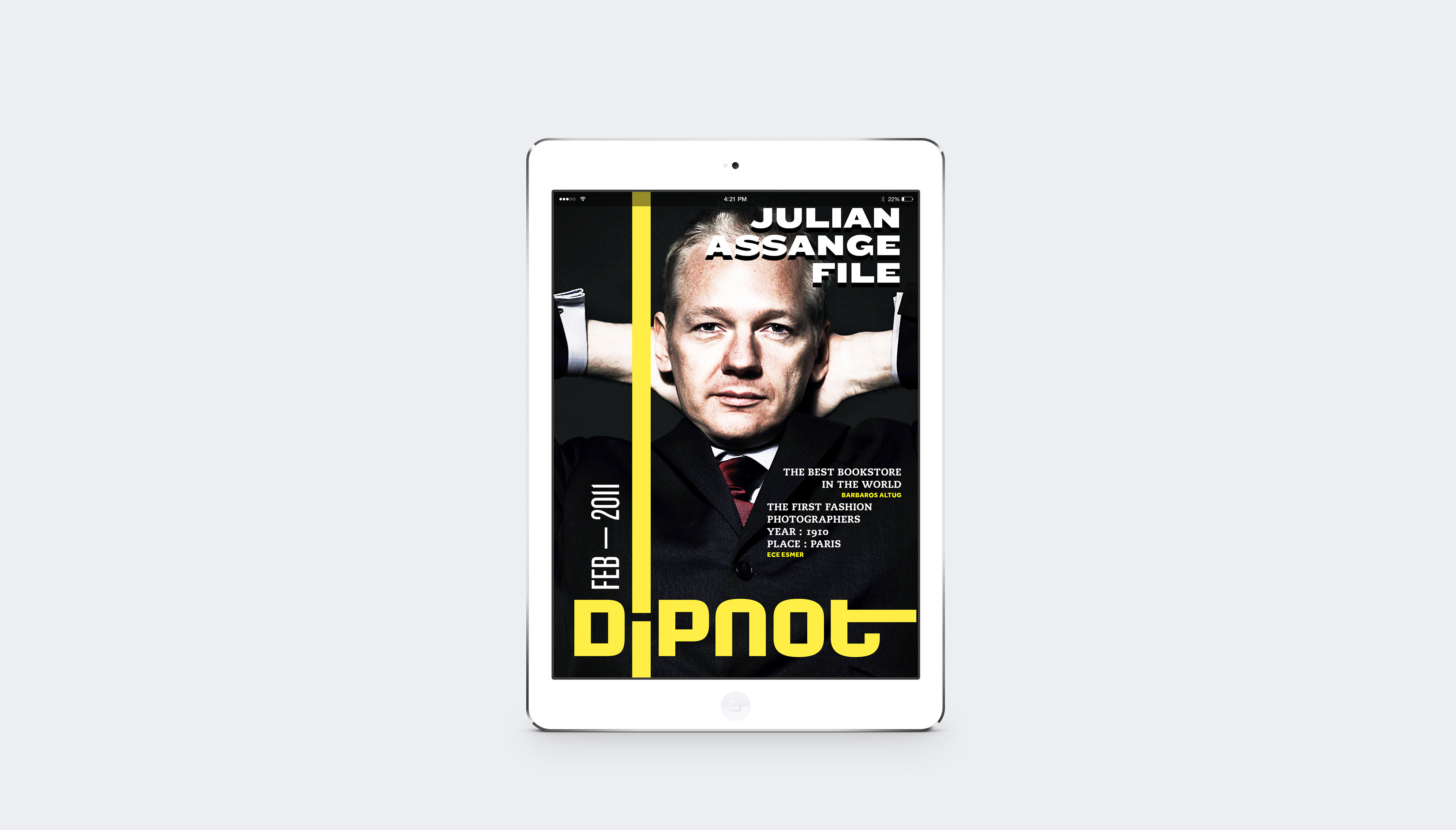
Dipnot: Footnote is the first bilingual tablet magazine that is considered
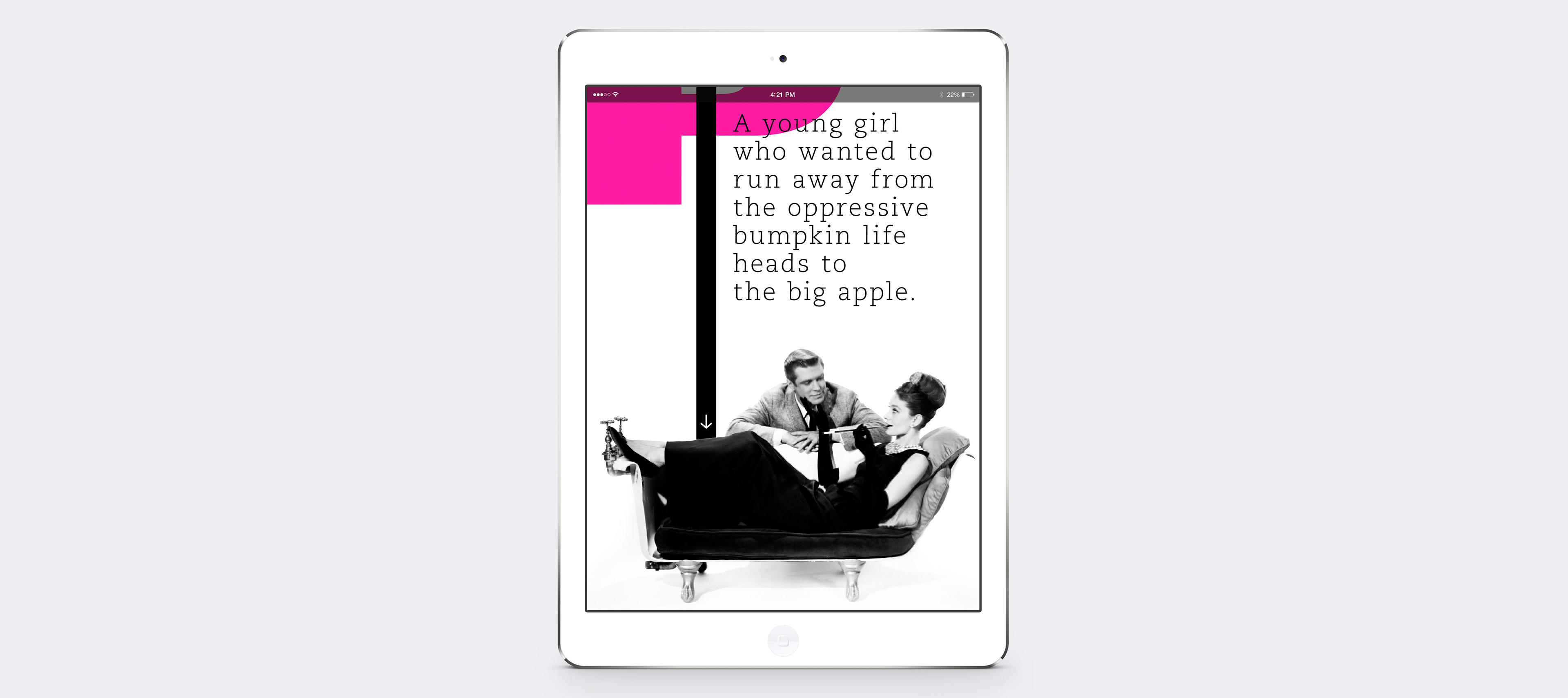
a pioneering digital publishing entity in Turkey. The design idea inspired through its meaning: a note with the added information that is placed below the text on a printed page, was simple. The logo would appear on the cover as a footnote then it would run through the entire magazine as a black line to impersonate a news person. It would weekly wrap around all need-to-know spots for you. And if you have any questions on the way it would be happy to guide you in the form of navigation. [Merriam Webster]
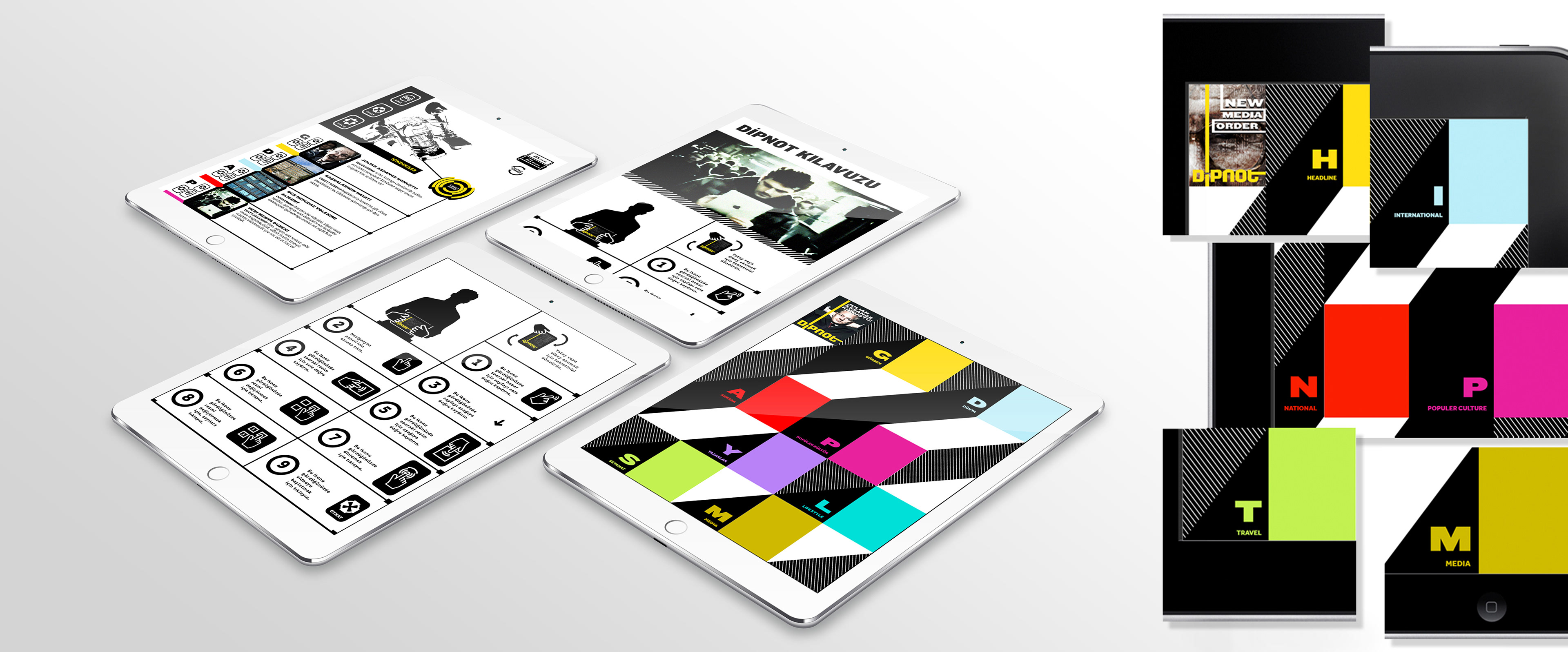
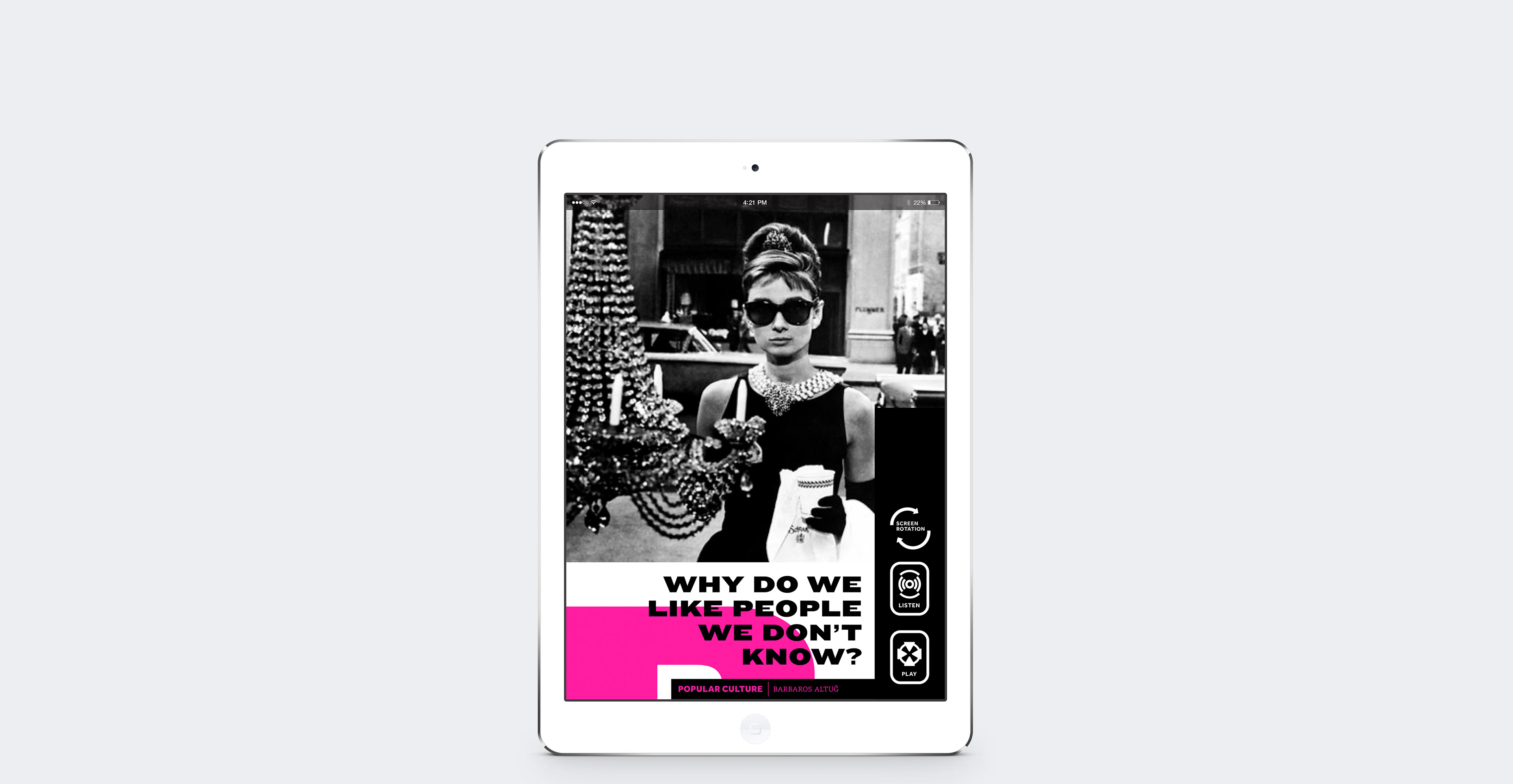
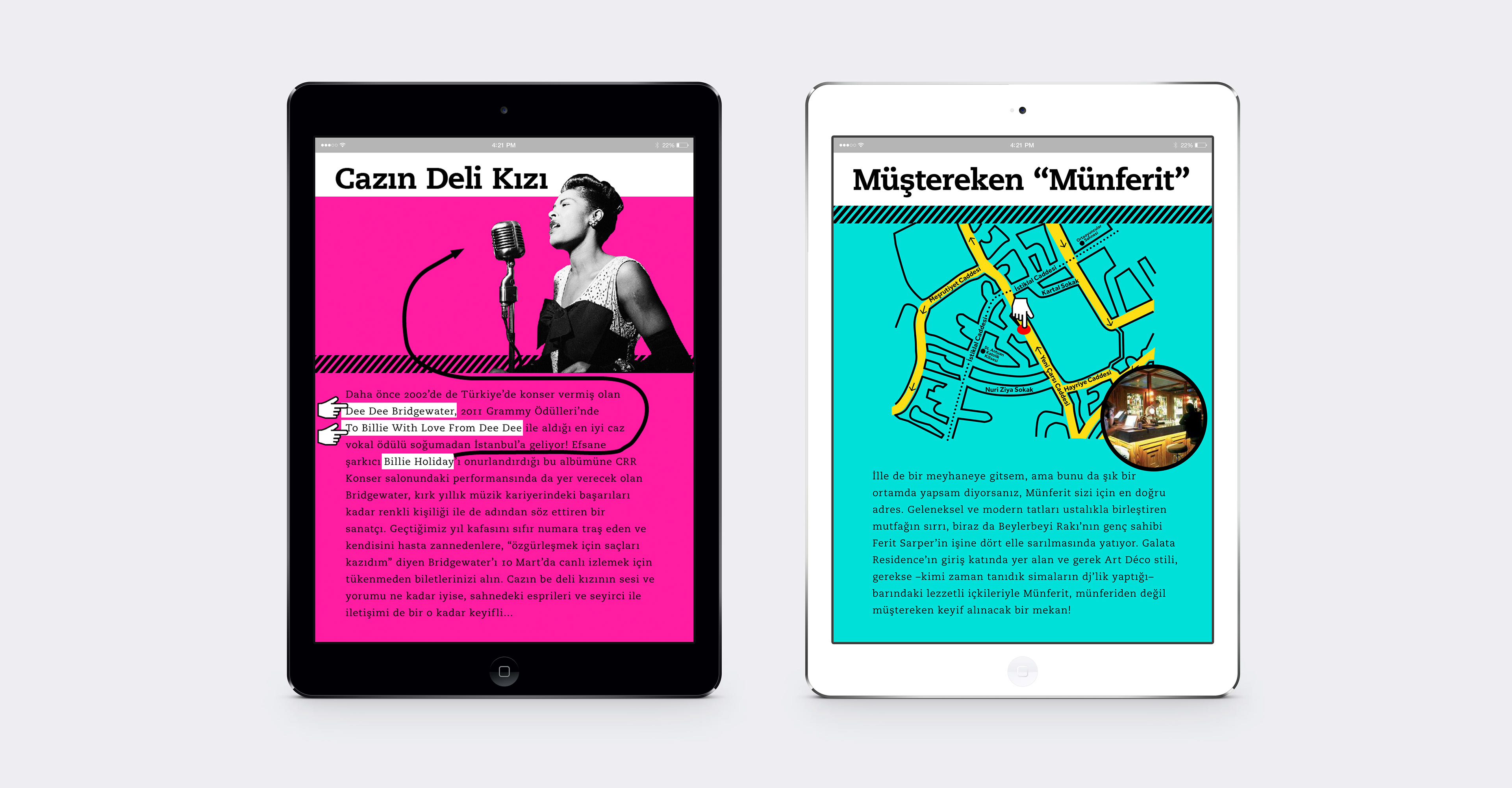
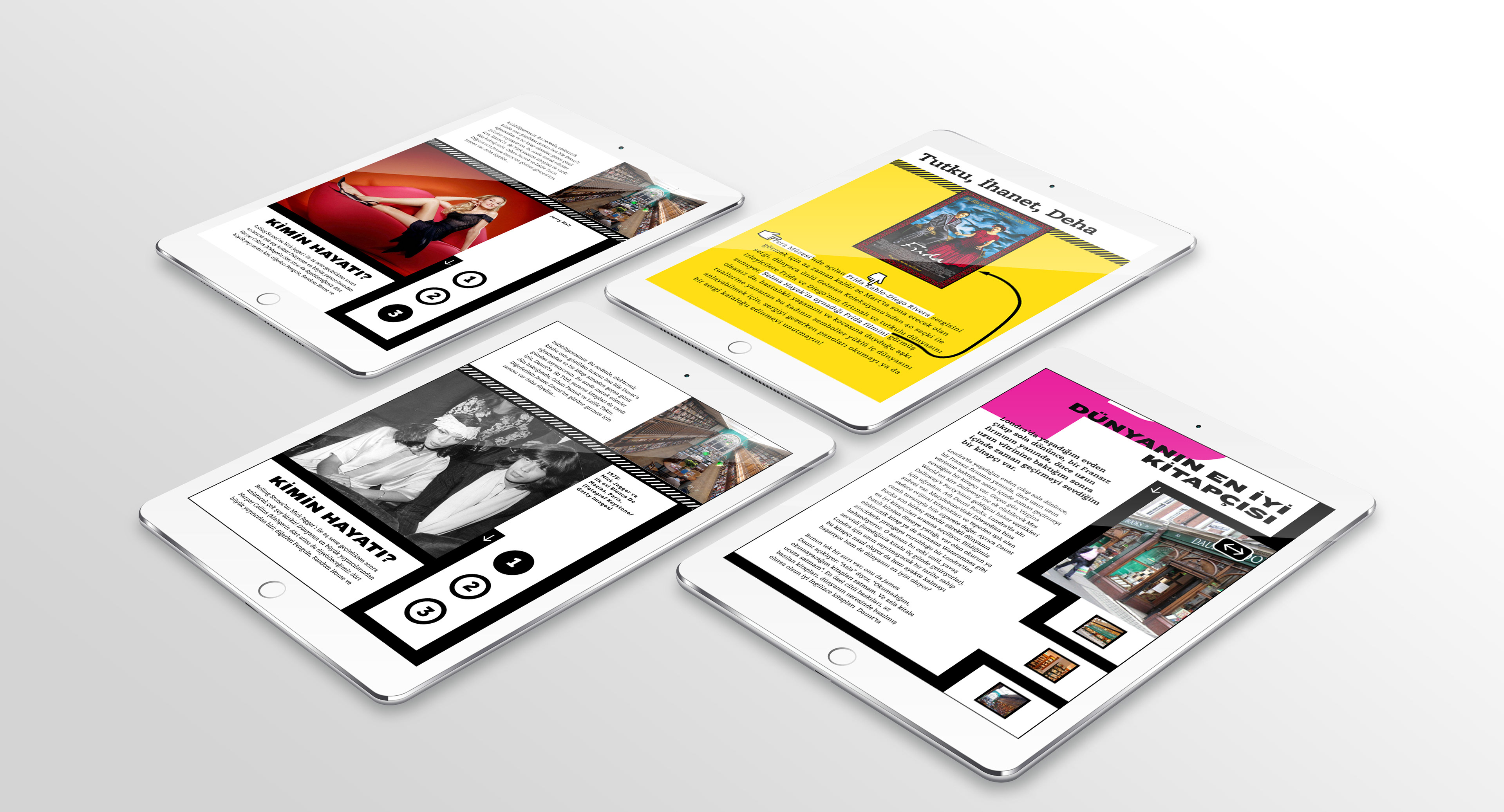
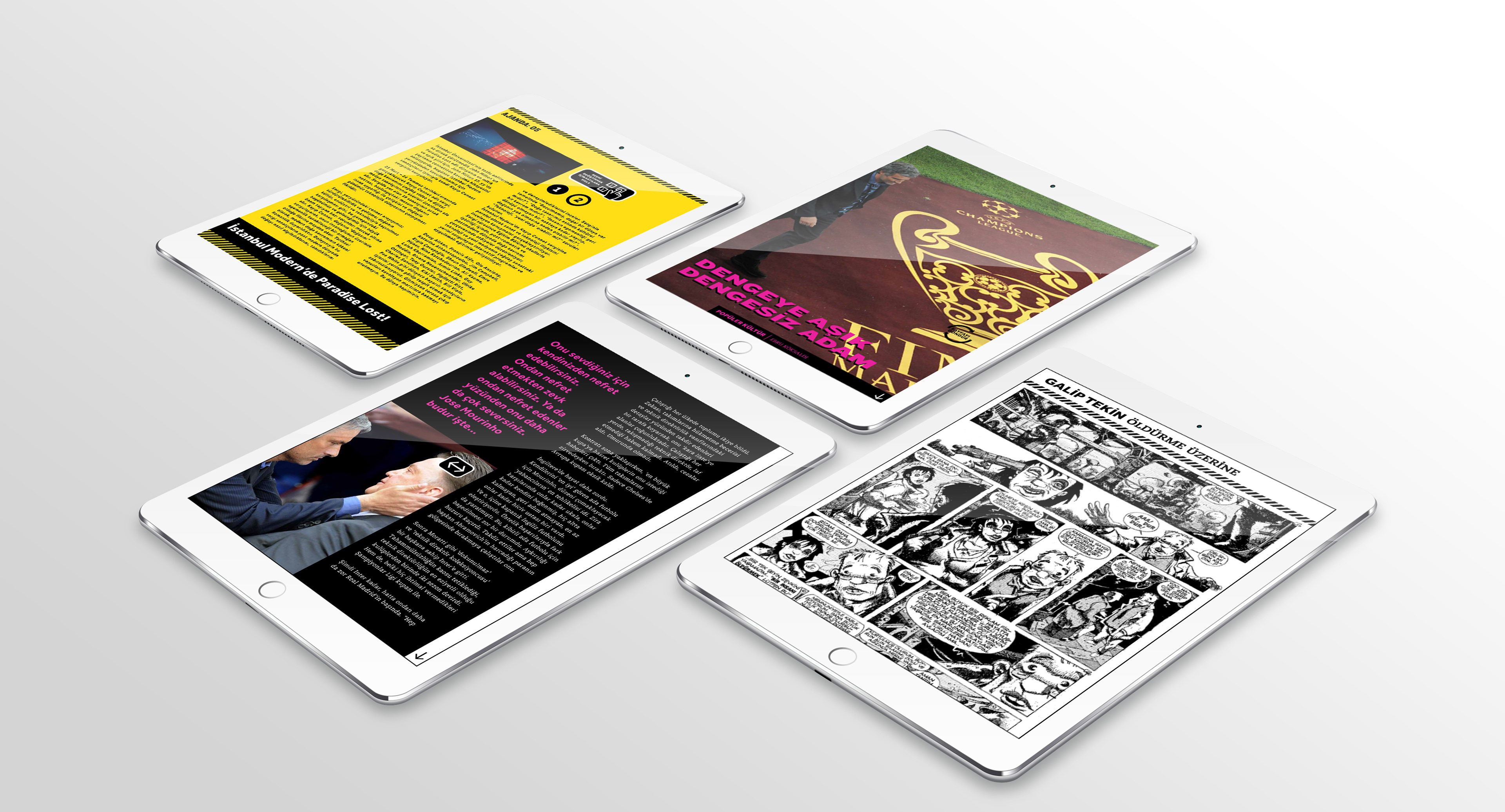
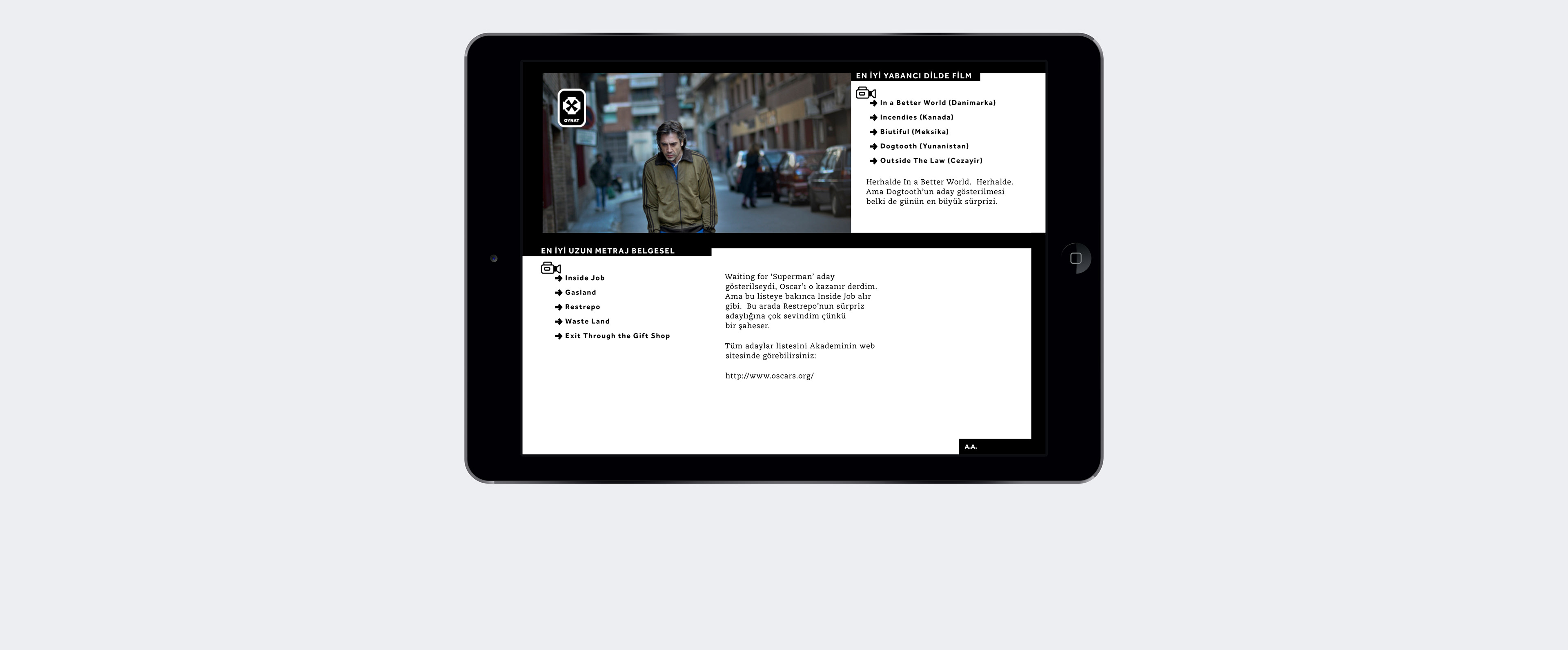
As part of the navigation, Dipnot would have a color-dominated design preference where each news section would be represented by a different color-coded initial. Such as yellow-H for “Headline: Gündem” or magenta-P for “Pop Culture: Popüler Kültür.” And the logo would also change its color due to the section where the feature article belongs.